Case Platforms · smallcase & Tickertape · Dec 2024–Present
Transforming product design from an execution layer to the strategy table
Joined as Head of Product Design to turn a scattered, service-oriented team into a strategic function with its own infrastructure, voice, and authority. Promoted to Senior Director within the first year.
One of India's leading wealth-tech companies
Case Platforms is the parent company behind smallcase and Tickertape, two products shaping how millions of Indians research, build, and manage their investments. Founded in Bangalore in 2015 and backed by investors including Peak XV and Premji Invest, the platform processes 100K+ orders a day and has facilitated over $5B in assets transacted via smallcases, sitting at the centre of India's fast-growing retail wealth-tech market.
The investing platform where people build long-term wealth through expert-managed portfolios and direct market access.
What it offers
The research and analytics platform where investors screen, analyse, and track markets before they invest.
What it offers
Design existed. A design function didn't
After several years without design leadership, design had become fragmented across product teams. While individual designers were succeeding within their verticals, the function lacked the leadership, infrastructure, and shared practices needed to scale its impact.
What 1:1s with every designer revealedNot present at all
Design leadership
The role had been vacant for years. There was no advocate for design, no coaching structure for the team, and no representation of design in leadership conversations.
Growth infrastructure
Designers had no career framework, competency model, or compensation benchmarks. Growth, performance, and promotions lacked clear expectations and consistency.
Design community
Designers were embedded within product verticals with little connection to one another. There was no shared craft, collective identity, or mechanism for learning across teams.
Present, but not working
Design's role in product
Design was involved in execution, not direction. Product teams brought fully formed briefs, leaving little opportunity for design to shape strategy, frame problems, or influence outcomes.
Trust and representation
Designers reported into product teams, where managers often lacked the context to assess design quality, craft growth, or long-term potential. Advocacy for the function was largely absent.
Motivation and retention
The team was talented and stable, but lacked visibility into future growth. Career progression depended more on individual product teams than on a coherent design practice.
Build product design from a fragmented service into a strategic function, one with its own infrastructure, voice, and the authority to shape what gets built.
Three buckets, built in parallel
High-performing design orgs don't emerge from talent alone. They need infrastructure, trust, and craft systems, none of them sufficient on its own. The work was split into three buckets and built across all three at once.
Team infrastructure
Build the scaffolding designers need to grow, be paid fairly, and trust the system.
Culture, built remotely
Forge a community across a distributed team with rituals that survive the screen and in-person windows used deliberately.
Craft & systems
Raise the ceiling on output. Design system, research practice, and an AI-native workflow built for leverage, not headcount.
Reporting restructured
All designers moved under design leadership on day one.
Career ladders built
IC and manager tracks. Explicit skill expectations at every level.
Compensation framework
Salary bands established. Gaps corrected with founder alignment.
Hiring process from scratch
Proven twice within a month. Later adopted by product management.
Weekly 1:1s and retros
Non-negotiable rhythms for trust and pulse-checking across screens.
Design jams + Slack channel
Collective identity and shared practice in a remote-first org.
In-person moments, used intentionally
Twice-yearly windows for depth, bonding, and brand-building.
Domain ownership model
End-to-end vertical ownership replaced fragmented project assignments.
Design system rebuilt
Scalable and AI-ready architecture. No new headcount.
Friction Log ritual
Team reviews core product flows together to surface quality gaps.
UX Research handbook
Usability testing turned into a repeatable, structured practice.
UX Writing agent + designers in code
Handbook converted into an AI agent. GitHub access; Figma MCP pilot won eng dev seats.
Rebuilding trust, retention, and a path to grow
The team had been on its own for years. Before anything else, they needed to believe design leadership could actually get things done for them and see a future worth staying for.
Career architecture built for designers
Replaced the inherited PM ladder with a purpose-built dual-track model, giving designers a real choice between IC and manager growth with design-specific titles at every level.
8
levels
2
tracks (IC + Manager)
Growth framework with ten capability areas
Each level has explicit expectations across hard and soft skills, giving every designer a clear picture of what growing into their next level actually looks like.
10
capability areas
Retention
Hiring
Comp bands built
Salary bands established. Gaps corrected with founder alignment.
Direct reporting
Every designer moved under design leadership on day one
Held the team
No regretted exits, just one departure to pursue music
Evaluation framework
Built from scratch, later adopted as the benchmark for PM hiring too
Onboarding + KT kits
New-hire onboarding and exit knowledge-transfer checklists
Two backfills closed
Replacement hires landed within one to two months
Turning eight people in silos into one team
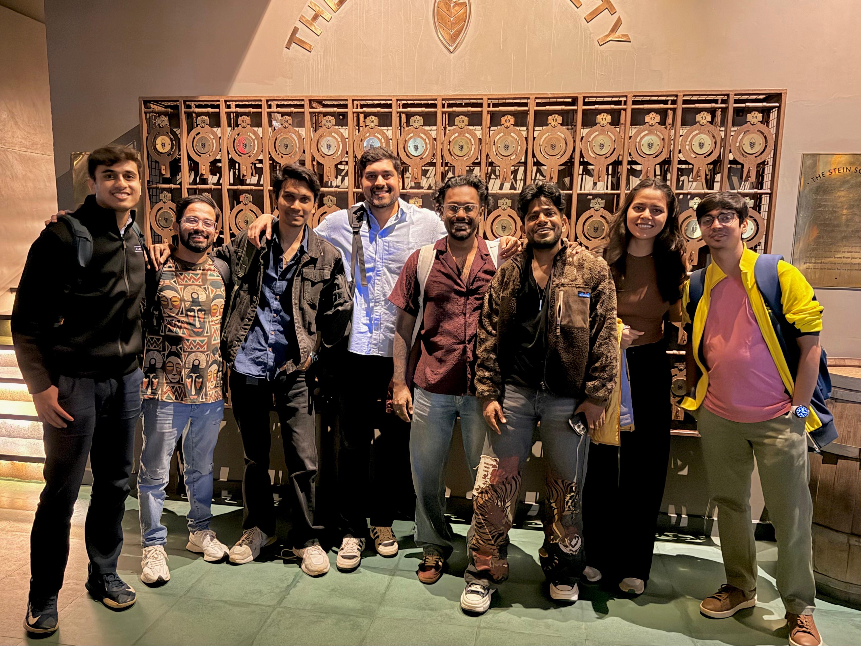
With the team meeting in person only once every six months, identity and trust couldn't be left to chance. Rhythms were built to survive a screen, and the rare in-person windows were used deliberately.
Rhythms and rituals
Connection and community
Direct reporting + 1:1s
Reporting moved to design leadership on day one, with weekly and bi-weekly 1:1s as a non-negotiable rhythm for trust.
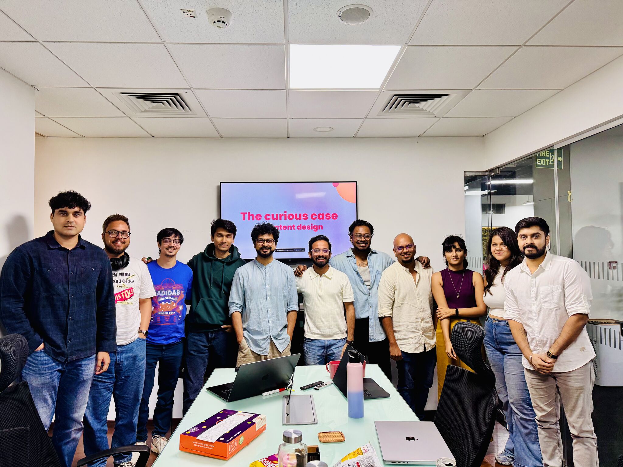
Weekly design jams
Brainstorming and critique sessions that made the team work and feel like one unit, not separate verticals.
Regular retrospectives
A team-wide retro process to capture sentiment and pulse-check how the interventions were actually landing over time.
#design Slack channel
An always-on home for design-led conversation across product and the brand design team it had never connected with.
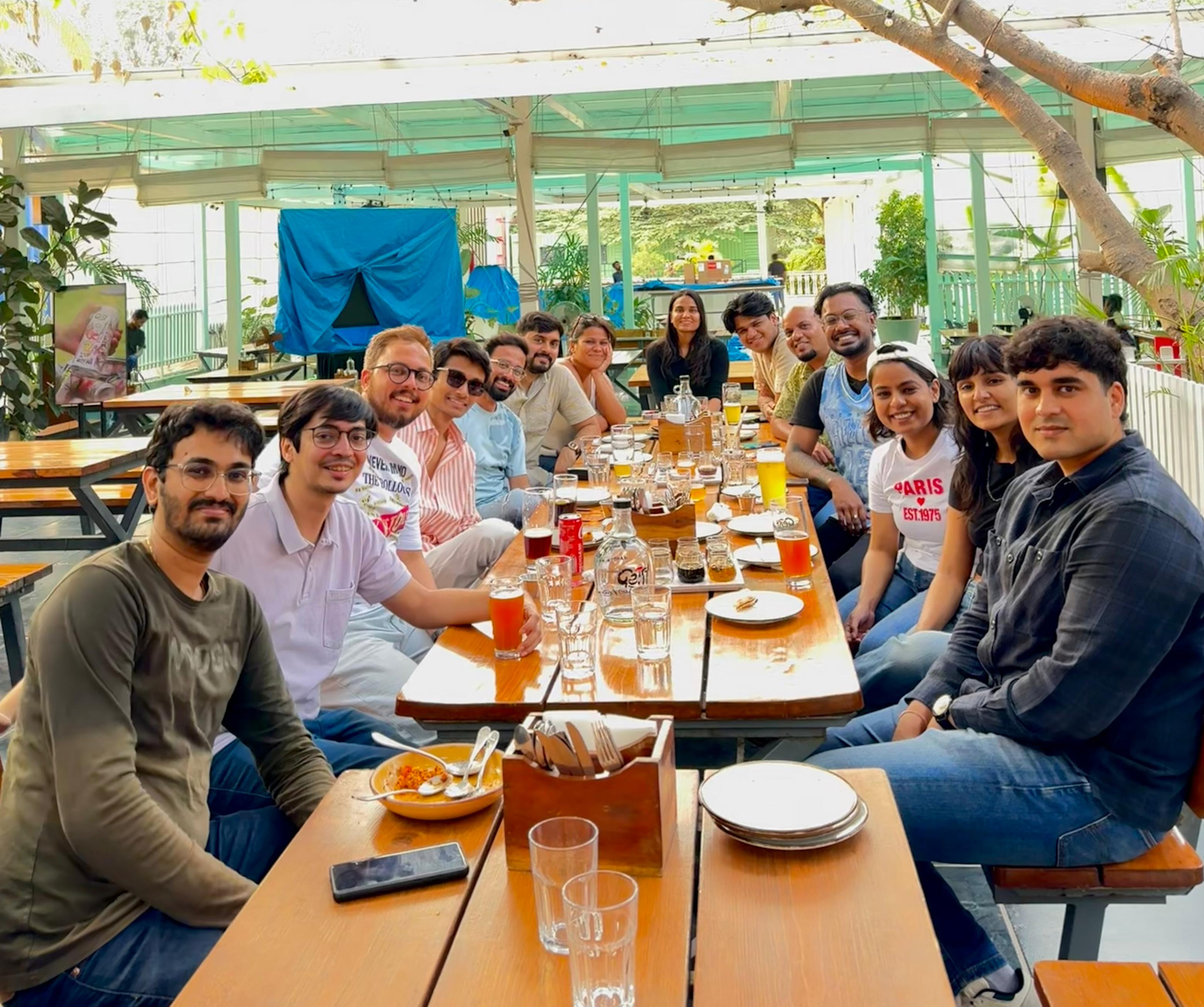
Cross-team connection
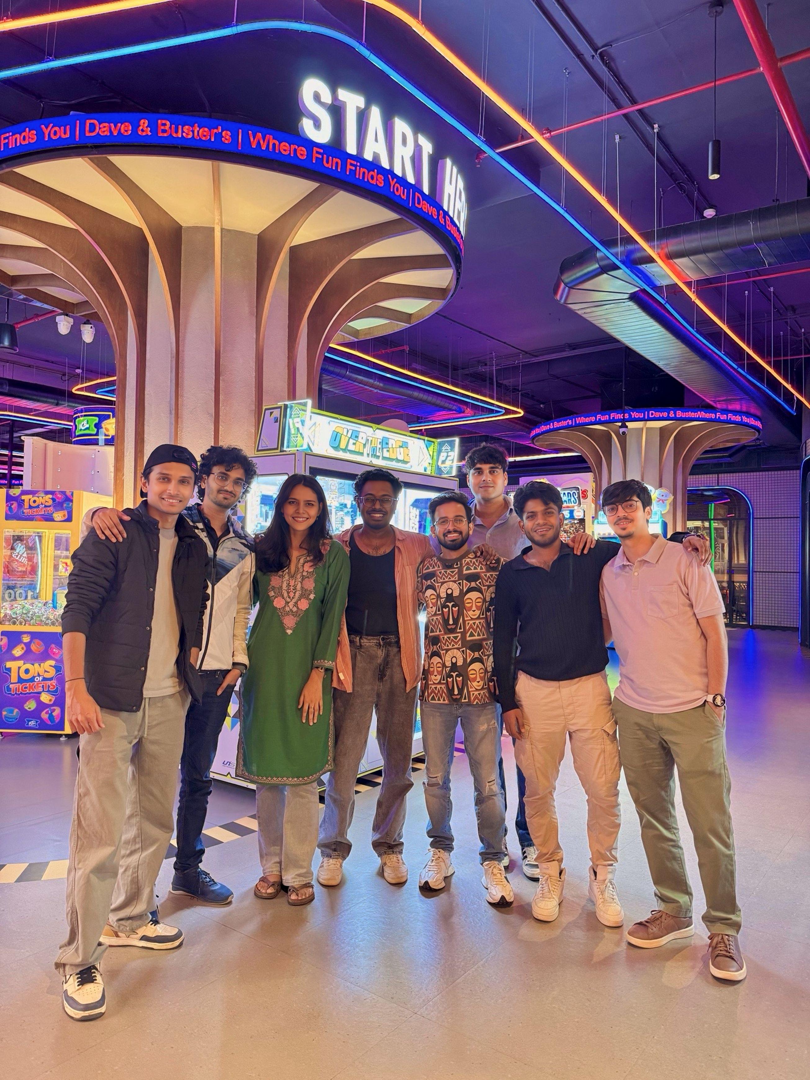
Opened communication channels with brand design and started meeting other functions far more often.
Outward brand-building
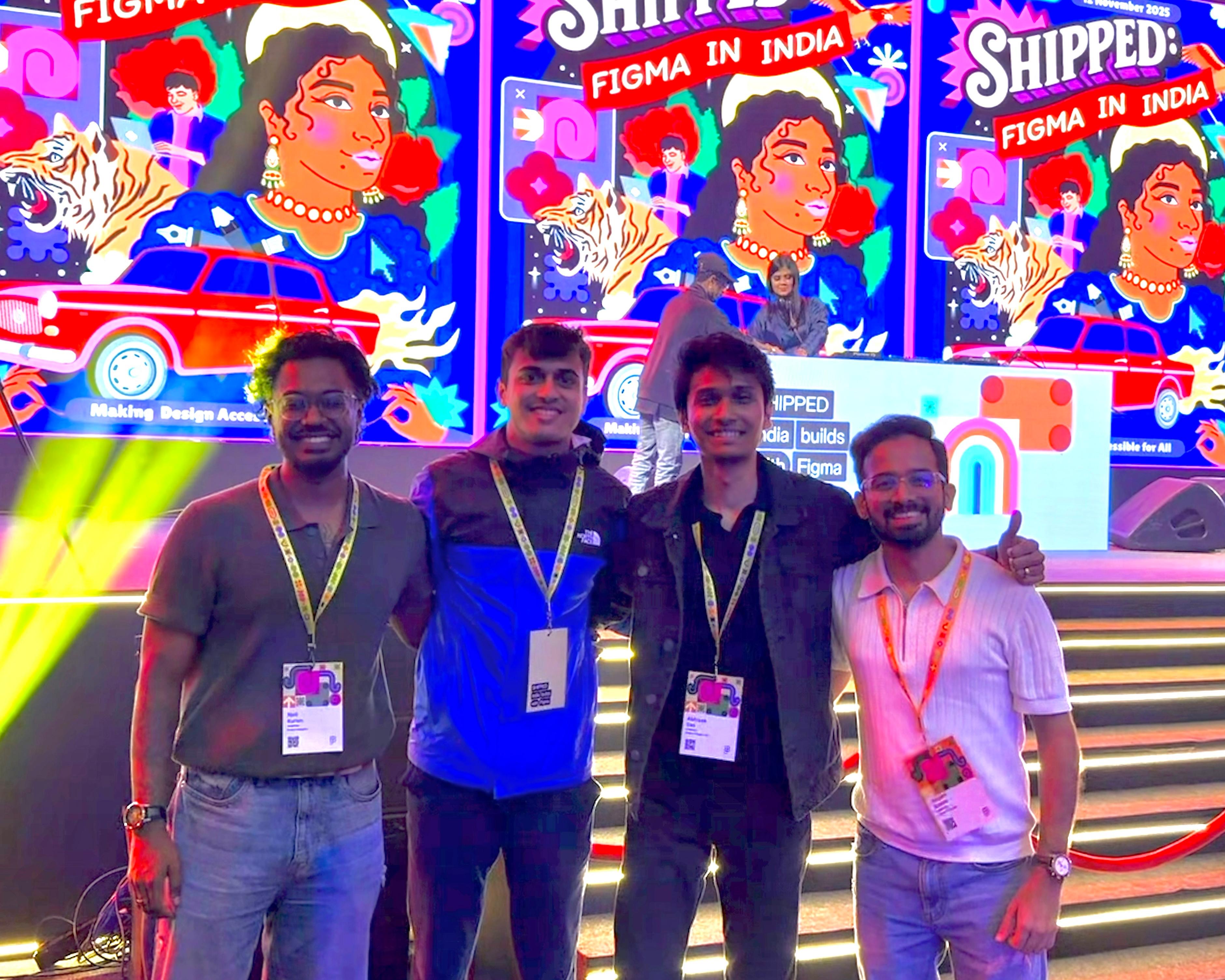
Took the team to conferences and events to put smallcase design on the Bangalore design community map.
The product design team now feels and works like one unit. That's something you've been able to achieve successfully.
Product Manager
Design autonomy is slowly coming into power, decisions are being finalised by designers, not product folks.
Product Designer
Really love how the design team has come together, from collaborations to team outings. Big thanks to Sugam for making it happen!
Product Designer
I've always admired the structure and motivation you brought to the design team. Glad we had time together, so I could learn from you.
Product Manager
Scaling design through systems, not headcount
With trust and team foundations in place, the focus shifted to increasing leverage. The goal wasn't to grow through headcount, but through better systems, stronger ownership, higher craft quality, and early adoption of AI.
Creating Clarity and Ownership
Domain ownership
Shifted designers from projects to product-domain ownership.
End-to-end domain ownership
Replaced fragmented project assignments with ownership of product domains, giving designers responsibility across every customer touchpoint where their domain appeared.
Deeper fintech expertise
Long-term ownership helped designers build stronger domain knowledge, enabling decisions grounded in both customer needs and financial concepts.
Better product outcomes
Consistent ownership across web, app, and other touchpoints improved continuity, reduced context switching, and led to more informed design decisions.
Design operations
Creating clarity, predictability, and quality at scale.
Cross-functional collaboration
Established a consistent handoff and collaboration model across product design, brand design, and engineering, reducing ambiguity and improving execution quality.
Planning and visibility
Made priorities, bandwidth, and dependencies visible through shared roadmap planning, enabling better capacity allocation and more predictable delivery.
Quality and decision-making
Introduced structured design reviews and stronger specification practices, raising quality and improving alignment across product teams.
Systems that Scale Quality
Friction Log
A recurring ritual where designers audit core user journeys together, creating a shared pipeline of usability improvements, engineering fixes, and AI-driven opportunities.
Product Design Vision Workshop
Aligned the team on a shared vision and the capabilities needed to become a best-in-class design organization.
UX Research handbook
Established a UX research handbook, repeatable testing practices, and a shared repository of insights, making user research more accessible and systematic across the team.
Figma source of truth
Introduced a culture of maintaining production-ready designs and flows in Figma, improving alignment across design, product, and engineering.
Building for an AI-Native Future
Design systems charter
Restructured foundations, components, and tokens into a scalable system with shared nomenclature and AI-ready architecture.
AI-powered UX Writing
Defined the brand's tone of voice, UX writing principles, and AI protocols, then operationalized them through a Claude agent used across design and product teams.
Designers who ship code, and a design system machines can read
A four-week pilot built the business case for Figma Dev Mode, securing GitHub and Claude access for designers and establishing AI as a roadmap priority with engineering. By making the design system machine-readable through Figma MCP, screenshot-based interpretation was removed entirely.
of designers now raise PRs to the codebase
token efficiency gain from MCP design foundation
of UI generated by engineering agents in the pilot
implementation accuracy on generated UI
Design moved from the execution layer to the strategy table
A design seat on the parent company's core leadership team
As the impact on the product design team became visible, a design seat was created in the core group of Case Platforms, the key leaders across every company in the parent group. Design had never been represented at that level before.
to Senior Director in year one
Leadership's vote of confidence in the function being built
regretted exits
The whole team retained, just one left to pursue music
of designers ship code
Raising PRs, building internal tools, and fixing bugs directly
The team's retrospective sentiment transformed. Design autonomy grew, decisions moved to designers, and the function that had been working in silos now operated and felt like one unit. All of it achieved without additional resources or cost.